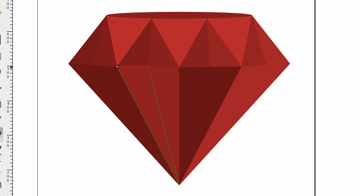
In this how to guide we’re going to draw a 3D (ish) ruby in Inkscape, just like the one pictured above. We’re basically going to draw two thin ellipses followed by a bunch of triangles. Doesn’t sound too difficult, right? It’s not.
I am using Inkscape 0.91 for this tutorial. While you can probably do all of this in earlier versions of Inkscape, I highly recommend 0.91. I really like this version.
See also: How to draw a nice, flat, single color lightbulb icon in Inkscape
I should probably mention that I am using a Mac. I don’t think this will make a lot of difference. The Inkscape interface and keyboard shortcuts are pretty consistent across platforms. If I run into any serious differences I will be sure to make make a note of it.
Setting the document up
Start by opening document properties control + shift + d. Set units and default units to pixels. Set width/height to 800px by 800px.
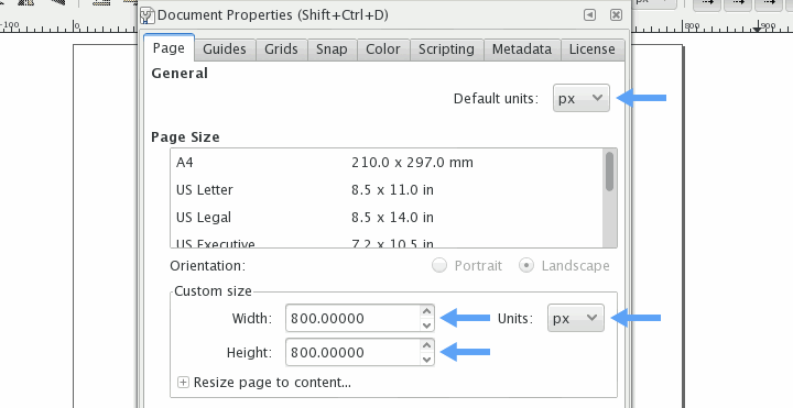
Also, make sure this is also set to pixels and these four buttons are toggled on:

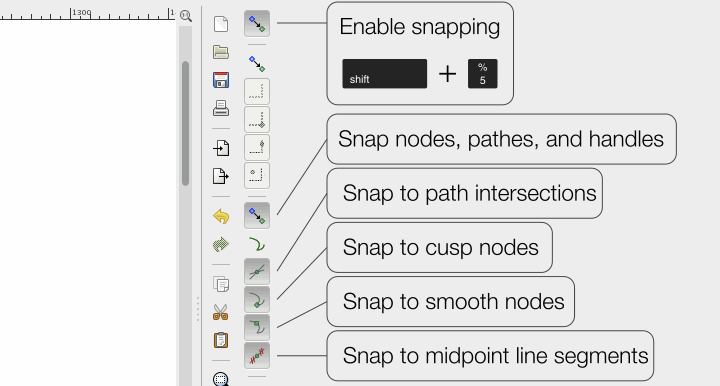
One last thing. Make sure to toggle these buttons so that we have the right kind of snapping. All other snapping options in the side panel should be set to off.
Just two ellipses and a bunch of triangles
(…and some rectangles to function as snapping guides…)
Draw a nice, thin ellipse. My ellipse is 420px by 20px but yours doesn’t have to be exactly the same. Try to imagine this being the top of the ruby.
Set fill to 9c0000ff (156R, 0G, 0B) and turn stroke off.
control + shift + F
Now, duplicate the ellipse control + D and move it down about 140px. You should be able to do this by holding down shift and hitting the down arrow seven times (each shift arrow should move the object 20px).
Now scale the bottom ellipse horizontally by 150%. Change the unit of measure to percent in the top menu panel, make sure aspect ratio lock is off, and punch in 150 next to W: (that’s width).

Don’t forget to set the units back to pixels!
If your original ellipse was 420px wide, 150% should make it 630px wide. I actually decided to make mine a little wider at 640px.
Now, open the align and distribute panel with shift + control + A and center the bottom ellipse horizontally to the top ellipse.
Make sure relative to is set to last selected.

Select the bottom ellipse, then the top ellipse. It is important to do it in this order so that the bottom ellipse aligns to the top and not the other way around. Click the center on vertical axis button in the align and distribute panel to horizontally center to bottom ellipse.

Use the rectangle tool to draw a rectangle that lines up with outer edges of the ellipses.

It is necessary to do this in three steps to ensure everything lines up properly.

Simply move the handle near the snapping point and hold it there for a second until it snaps into place. The snapping in Inkscape can take a little getting used to but works great once you get the hang of it.

Duplicate the first rectangle with control + D. Then resize horizontally until it snaps to the center of the first rectangle.

Resize the first rectangle until it snaps to the left side of the second rectangle.b

Continue this process until you end up with four rectangles.

Duplicate, resize

Duplicate, resize

Duplicate, resize

Before you know it, you’ve got four rectangles right where you need them!

Open the fill panel with control + shift + F. It might be helpful to set the color of our newly created rectangles to something other than red. Perhaps a nice shade of blue.

Using the rectangles as snapping guides, draw four triangles.

Delete the four rectangles. I know, so sad :(

Using the path node editing tool (F2) snap the tops of the left and right triangle to the left and right outermost portions of the top ellipse.

For this next part we’re going to need to enable snap to paths. I like to leave this disabled until it’s needed because it can cause Inkscape to slow down, especially with complex files or on slower computers.
See also: A quick reference for Inkscape’s path editing tool (node tool)

Ok. Snap the bottoms of the triangles to the bottom ellipse, one node at a time. We want the nodes to maintain their horizontal alignment we’ve set up, so hold down on control while dragging each node.

Drag the bottom left node of the second from left triangle 20px to the left. Do this with shift + left arrow. Do the same thing to the second from the right triangle 20px to the right shift + right arrow. Realign with bottom ellipse.

Align the tops of the middle two triangles to the top ellipse. The top nodes on both triangles can be selected at the same time using shift select.

I ran into some trouble snapping to the top ellipse. If this happens, try converting the ellipse to a path. Once converted, select one of the nodes in the ellipse. Use shift + arrow keys to move the node out of place then back into place. This seems to reset things enough for proper mid-path snapping.

Delete the bottom ellipse.

Draw a new rectangle, snapping to the left and right outermost points of the far left and right triangles. I made mine 352px high.
Lower the new rectangle underneath all of the triangles by pressing page down about four or five times. On the Mac, I use fn + down arrow to accomplish this.
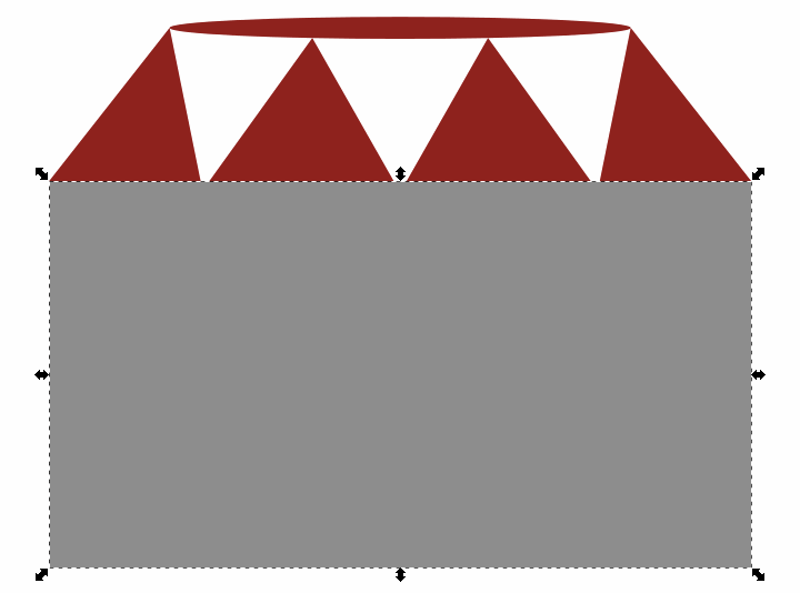
Disable snap to paths.

Using our new rectangle and the bottoms of the four triangles as snapping guides, draw the bottom part of the ruby
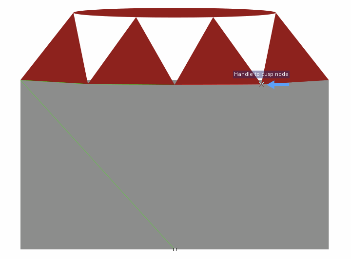
Delete the rectangle and and we’re left with a pretty awesome ruby outline. Now all we have to do is add detail and color. The easy stuff.
The hard part is over

I think all that aligning for the 3D (ish) look is the hardest part of this how to. Especially if you aren’t used to doing this kind of thing in Inkscape. I promise, it gets easier.
OK! Let’s do some coloring. We want the four triangles in the top of the ruby to progress from slightly darker to slightly brighter than the color of the top ellipse. Open up the fill panel with control + shift + F. Use hue, saturation, lightness (HSL), to adjust the lightness of each triangle. We want hue and saturation to be uniform across the ruby.
Starting with all colors the same as the top ellipse of the ruby (9c0000ff) I used the following lightness levels (from left to right): 72, 78, 83, 88. The top ellipse has a lightness of 78, so you can see the triangles go from slightly darker to slightly brighter. Feel free to adjust to your preferences.
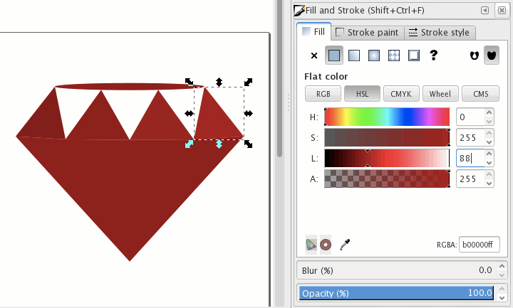
Good, now draw the background shape that will provide our fill color for the triangular negative space. All the handles except the bottom middle should be snapping to the triangle points.
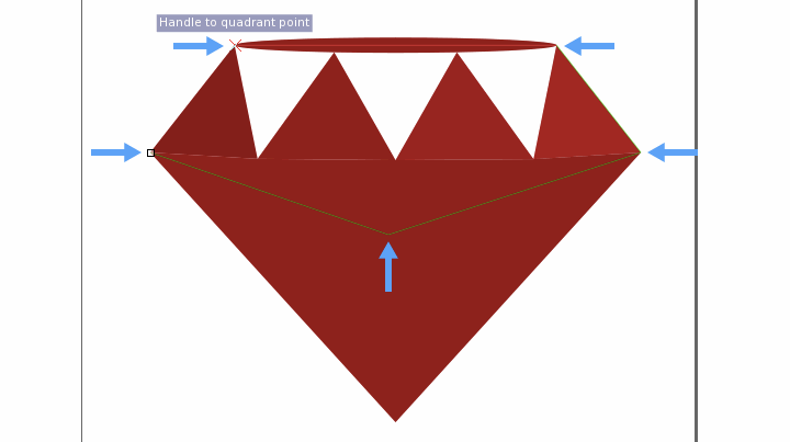
Color the new shape a decently bright red. I went with d00000ff. That’s the same hue and saturation values as the rest of the ruby but with a brightness of 104.
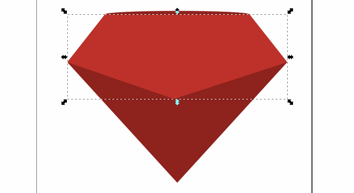
Send the fill object to the back. Hit fn + down arrow about six times. That’s page down if you have that key on your keyboard. end should also work (send to bottom).
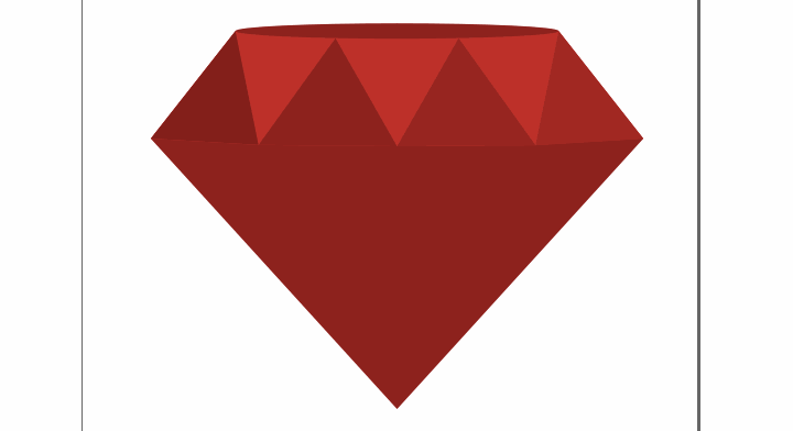
Draw four triangles, using the corners of the existing triangles for snapping guides.
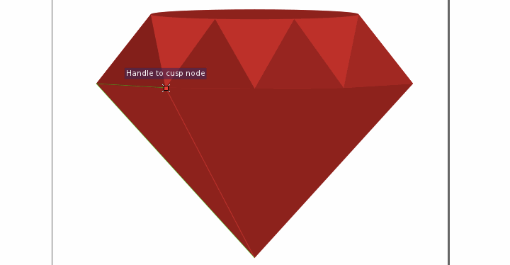
Color the new triangles progressively lighter shades of red. Start with a slightly darker shade than the triangle above and end with a slightly lighter shade than the triangle above. Shade the triangle second from the right a little darker than everything else. Keeping the same H and S levels, I did L 60, 80, 60, 95 (from left to right). Ok, so the triangle second from the left isn’t actually darker than everything else. But it’s pretty dark. I think this looks good.
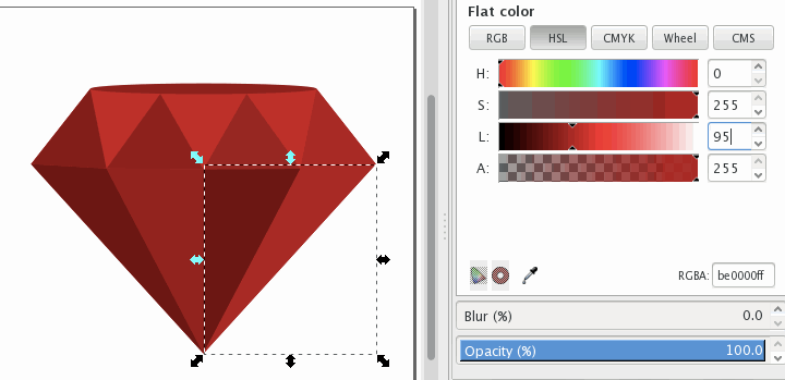
Draw four half triangles in the upper part of the ruby and shade them all slightly darker than the triangle they are partially covering. Again, keeping H and S the same, I’m doing L 67, 73, 78, 83 (left to right).


Do the same thing with the bottom triangles. Draw four half triangles covering the left sides and color them slightly darker. L 55, 75, 55, 90 (left to right).
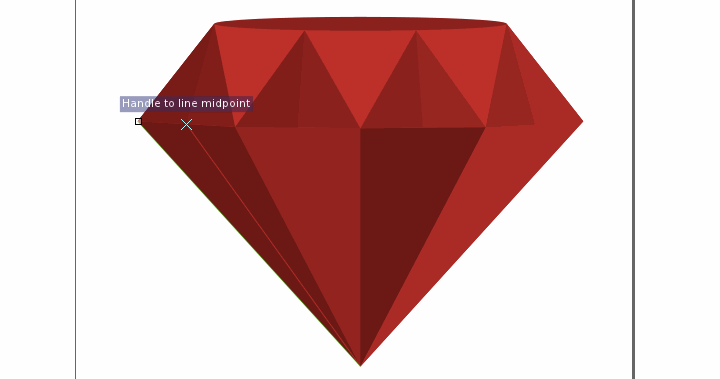
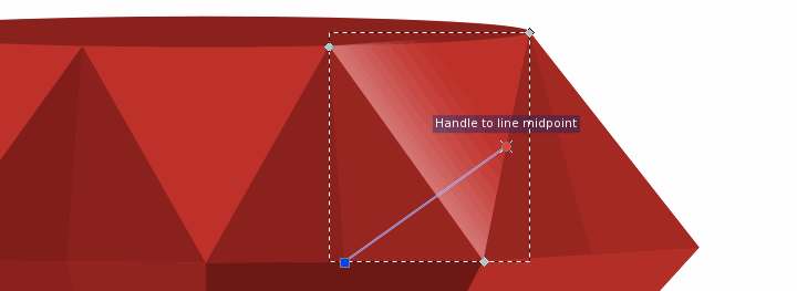
One last thing and we’re done. Draw one last triangle completely covering the down pointing triangle furthest to the right on the top part of the ruby. Select linear gradient from the fill panel.

Double click the gradient triangle to bring up the gradient handles. Set both to white. Set the alpha of the left to 180 and the alpha of the right to 0.
